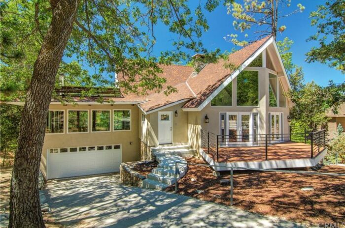
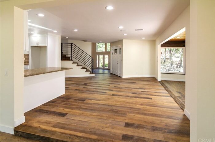
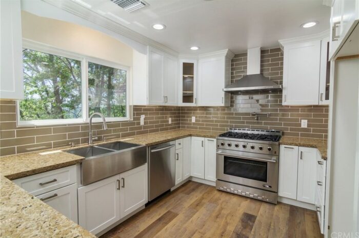
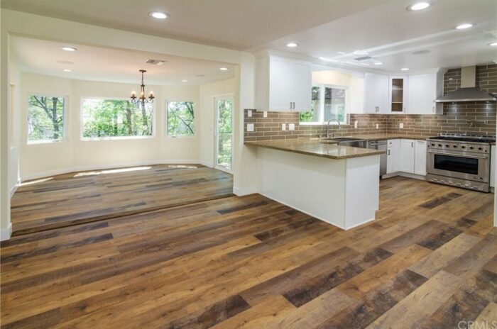
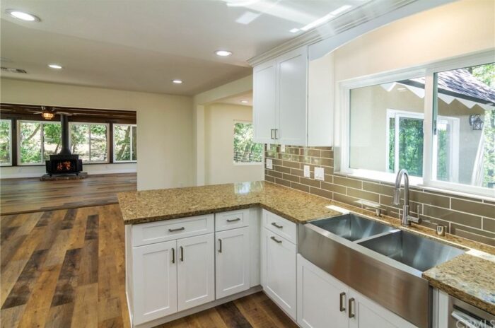
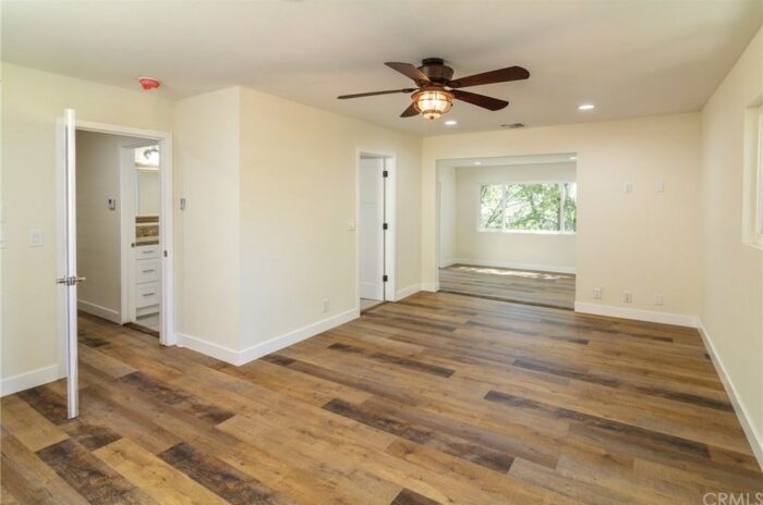
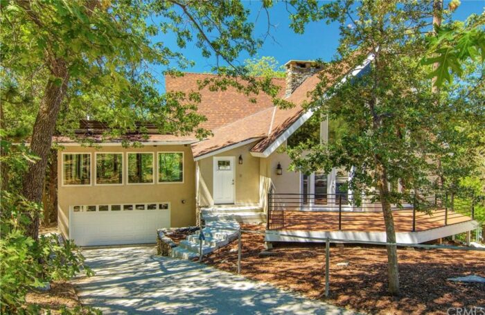
I am slightly OBSESSED with this mountain house. I LOVE the layout and open floor plan and I love most of the upgrades done to it, which is rare. Oftentimes I’d rather just find a really cool place that hasn’t been touched, but this place is move-in ready. I would make a few small changes, but overall the design is pleasing. I almost wonder if the same people flipped it that did the house I live in now?
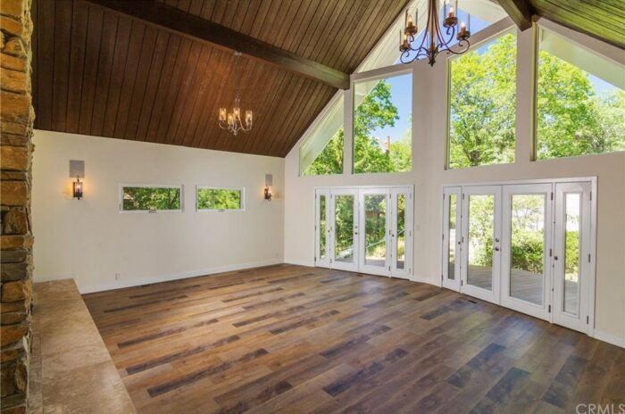
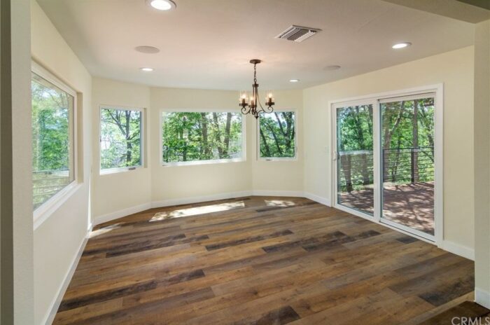
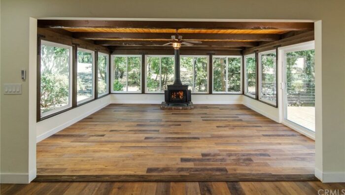
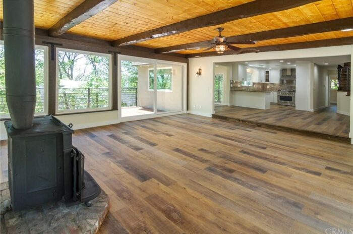
I love the windows. Windows are so important to me in homes, but living in the middle of a forest, on the top of a mountain, makes windows even more important because the scenery is not only incredible to look at visually, it’s incredibly peaceful to live in as well. It feels like you’re also bringing the outdoors in, which is wonderful – to me, anyway.
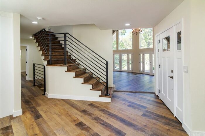
I love the extra living area and I love the dining room. The kitchen is a little small, but because the space is so open, it seems functional.
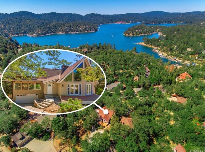
The location is also nice, though I do prefer the opposite side of the lake (where I am now – see second photo from the bottom for a lake visual – my house is somewhere across the lake and a little left of the red rooflines you see in the distance – which I think is the Village) even though it gets darker earlier on this side, I love that I can walk to the Village or Cedar Glen if I have to (like when it snows and you need food and can’t (or don’t want to) dig your car out 😉 – but that rarely happens).
But still. I love the feeling of this house, and that’s usually what I go by.
You can check out the listing on Zillow here: 1102 Highway 173, Lake Arrowhead, CA 92352 NOTE that I don’t pull all the photos from the listing, in case you want to see more. This house is 4 beds 3 baths 3,698 sqft and on the market for $649,000
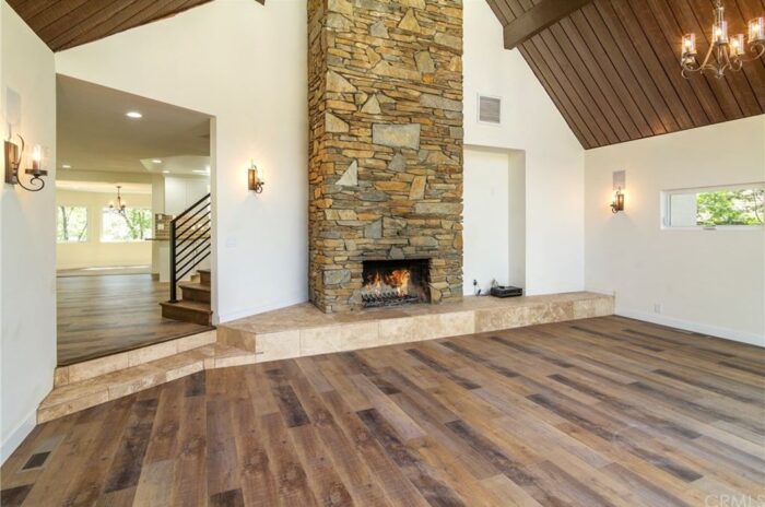
I don’t generally like mixed stone (notice the fireplace and the hearth are two different surfaces, but I love mixing stone with wood (or faux wood, which is what I think this is). What I LOVE about this space though is the way they took the stone from wall to wall instead of stopping the hearth at the door and creating a wood step. I love the look of the stone step.
I do wonder though, why people prefer to hang their flat screens on the wall RIGHT NEXT to the fireplace rather than mount it right to the stone (note the area NEXT to the fireplace)… I understand that people often argue that they don’t want their TV to be the centerpiece of the room, but lets be honest here, the reason to go use the room with the TV IS TO WATCH TV… which means, it’s the centerpiece no matter what.
I’m so used to seeing a TV hung above a fireplace, that I’d never notice it above the fireplace as looking like an eyesore. What I DO notice is that the entire room feels off-center when the TV is hung NEXT to the fireplace. It creates a certain chaos to me UNLESS the wall NEXT to the fireplace IS the center of the room instead of the fireplace center of the room. In this case (and in many) the fireplace is center and now by putting your TV NEXT to it, it’s off center and that’s the visual chaos my eyes can’t stand. Everything just seems off.
Better yet, face your couch a different direction completely and hang your TV on a different wall! Like NEXT to the fireplace is just now competing with the fireplace. Do you see my point?
I’ve had this conversation with both my mom and my brother, who opted to put their TVs RIGHT NEXT to their fireplace… and it drives me insane 😉
So I need a better reason OTHER than they don’t want it to be the focal point of the room because let’s face it, now that it’s OFF CENTER – – – IT IS THE FOCAL POINT OF THE ROOM 😉 I’m not really yelling BUT I AM! lol
Happy Sunday Lovecats!
* Find all my Sunday Property Crushes here
* Find all my Lake Arrowhead posts here

