We moved into this new house at the beginning of June and since we already had so much stuff (that actually complemented the space, it was pretty easy to decorate) and I’ve been meaning to share it with you since July. Though, I have to admit, that since it’s a rental, there seems to be far less pressure (self-induced, of course) in making it look “perfect”, which is quite freeing actually.
We painted a few rooms and did the fun geo wall in the girl’s room, but other than that, it was move-in ready.
This house was actually listed for sale for quite a while and I remember looking at it a few times on Zillow and even saved it because I loved the layout. But in May it was suddenly available for rent and since I wasn’t sure I wanted to buy again just yet, it was the perfect option for us. And quite honestly, I am still considering buying it, but I am not sure if I am in love with the area and also want to see how challenging it is during the winter months. It’s located at the bottom of a pretty steep street with a stop sign on the corner and also has a pretty steep driveway up to the garage and no level entry. So winter will be the make-it or break-it moment for me… but in terms of the house, I love it and felt at home almost immediately.

I love the hardwood floors and high ceilings, the large windows and sunlit days filter the perfect amount of light throughout the entire house, and I just love the layout and the overall energy of the space. It feels so much lighter than my previous house (which I honestly do not miss at all) and I hear myself saying, more often than not, I love this house… don’t you just love this house?
After such resistance leaving my past house behind, holding on so tightly to it, scared to physically and mentally let it go, I think I’m constantly surprised by how much I adore living here in the new house and just feel so much lighter in general.
It should be noted as well, even though it’s completely off topic, that two months after moving in, I happily sold my ring and sent it to a new home to love… and just being in the new house, in a completely new life, I finally felt like my past was a finished chapter and I was free to move forward.
Anyway, the Living Room…
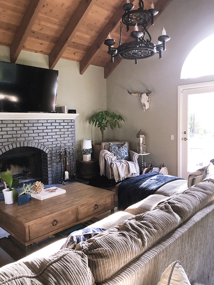
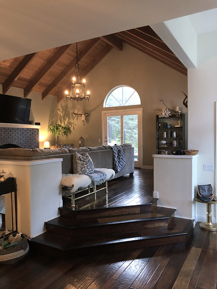
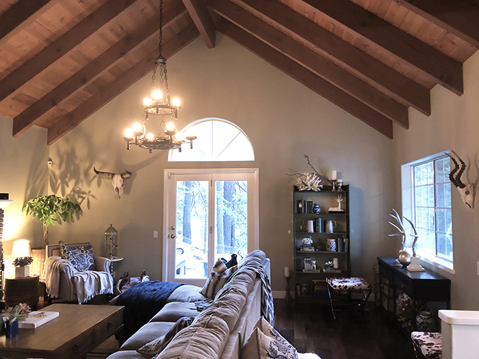
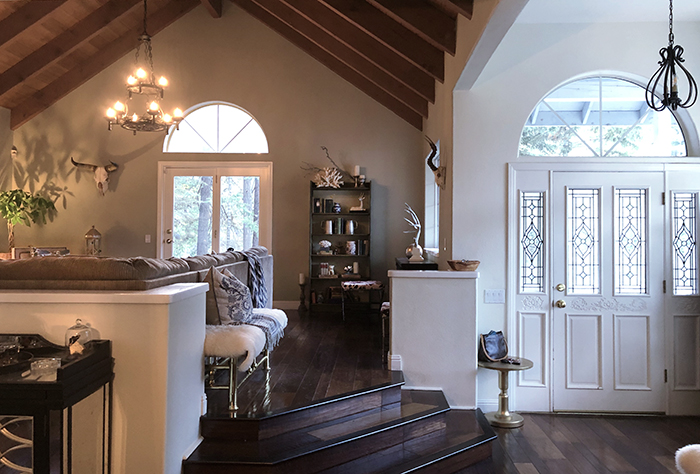
It’s to the right of the entryway and three steps up, which is a design element I love, because with the high ceilings, it makes it feel more special. It has partial walls that block off the space but that open it up to the dining room and the kitchen, and has two large windows and glass doors to the side patio. The fireplace, though quite large for actual size of the wood burning area, is a great focal point but the mantel is so high that the TV is also too high but there was no other real option to hang it. It works, but this space would make a much better formal living room if the house had a separate den or family room in addition to it.
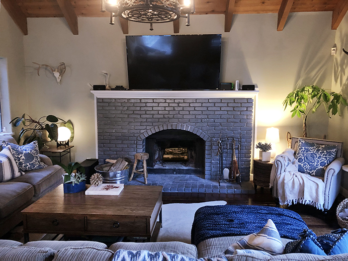
The walls are a soft green and the mantel is almost metallic grey, which is a slightly odd choice, but we left it as is because we didn’t mind it, especially once we moved the furniture in.
Speaking of furniture…
We had a major couch battle and here’s why…
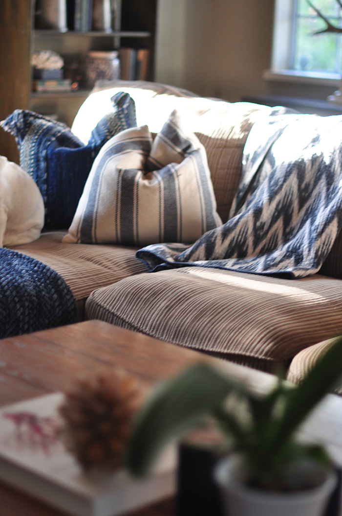
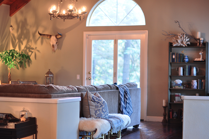
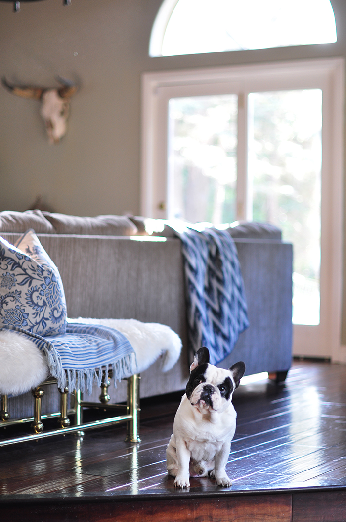
Because of the wall colors and the size and layout of the space, I thought my couch would visibly look better in the room. It’s a dark charcoal grey (though it looked blue in my last house, oddly enough) and though it is deep, it’s much smaller length-wise and insanely comfortable. His couch is massive and brown and I thought the brown would compete with the wood ceiling and floor and look too “brown”. But once we moved his couch in to try it out, the color softened and took on a more neutral tone (which changes depending on the lighting) that looked really nice with my blue decorative pillows and accents. I was ready to scrap the blues all together, but once I set them on the couch, it complemented it and tied the whole room together.
Another reason I was against his couch was that I didn’t want the entire living room to be COUCH and the only way it fit was with its back to the entryway, which I thought felt uninviting. However, once again, when we arranged it into the corner and then added my old coffee table and chair in the opposite corner, it worked! The back of it creates a nice walkway and it feels really cozy and comfortable in the space.
I still have to admit that it’s not my favorite style of couch and isn’t as deep as I like, but having so much room to spread out with dogs and kids, is actually really really nice.
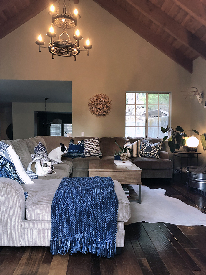
Do you see how big it is?
Anyway…
I was determined to not spend a dime buying “stuff” for the house. Combined, we have plenty of stuff to fill three houses and so I wanted to see how creative I could get with what we already had. Some of this stuff you have seen in my past two houses, but I think it’s really fun repurposing everything and finding completely new ways to use what we already have. Hopefully it will be fun and inspiring for you as well to see how I’ve taken the same stuff and used it in new spaces effectively (again, I hope).
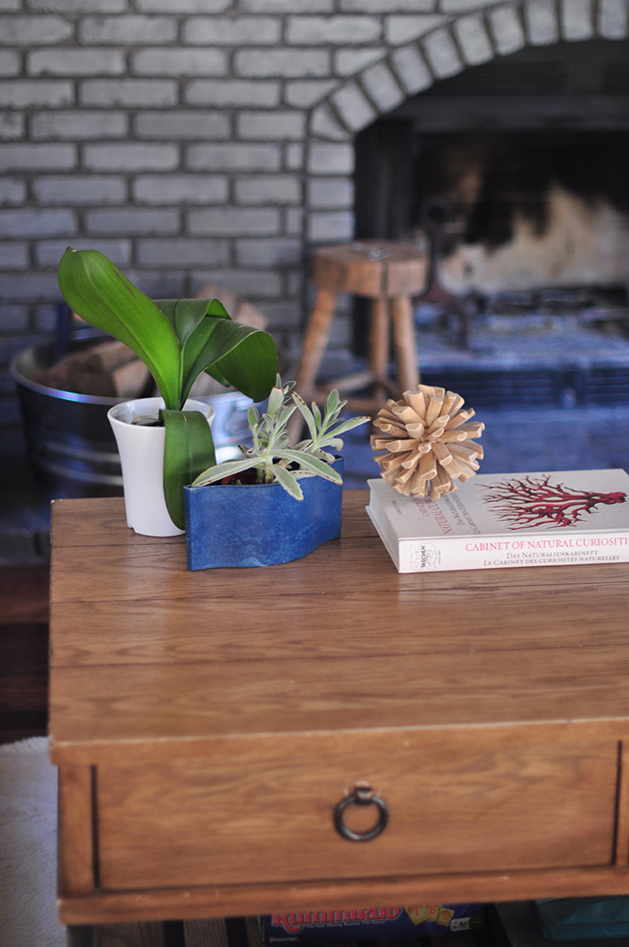
I pulled my coffee table and chair from my old living room (along with a few decorative items) and the green-stained wood shelves that were up in the reading room (which I actually purchased for $25 at a thrift shop in Burbank about 20 years ago), along with the faux cow-hide ottoman/stools and layered my faux cow-hide rug over a shag rug and it worked. Once I added my DIY feather juju hat and vintage cow skull, everything kind of just flowed. I filled the shelves with vintage books in green/blue/browns along with a few faux coral sculptures, blue and white vases and other rustic design elements to pull the look together.


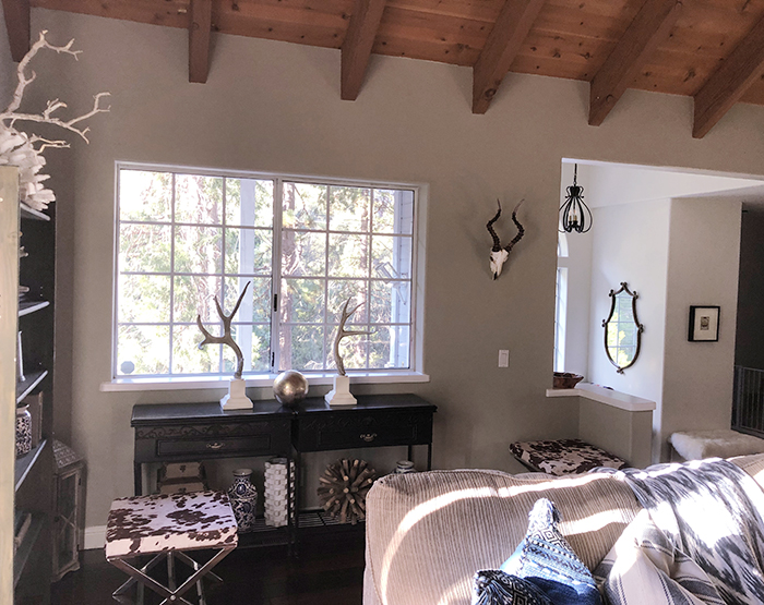
We did buy one new/old thing for the space… the deer skull on the left of the tv (photo below), which we found at a local vintage shop for $40. The cow skull is my stepdad’s and the other skull by the entrance (photo above) is fake along with the mounted antlers.
There’s clearly a rustic mountain vibe meets vintage hunter’s cabin them going on, which is why I couldn’t resist pulling in some of my beachy coral pieces to lighten the mood, as well as the blue and white floral pillows and vases. Somehow I think it works… and have to be honest, looks better in person than in photos (like most things).
We may eventually buy a large rug so the couch doesn’t slip around, but I really like the way the faux cowhide creates a more interesting visual floorspace instead of the sharp edges you’d get with a regular rug. But we’ll see. Also I’m thinking new plants may be in order, but for now we love it.
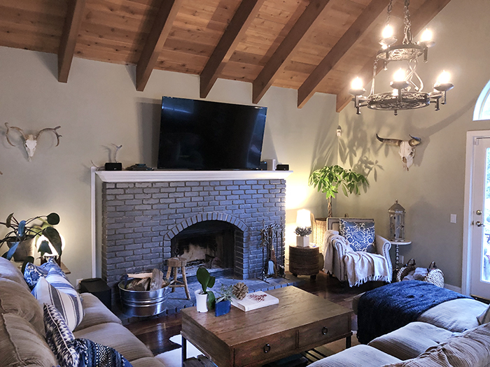
It may go through some changes in the future, as all rooms do, but for now, it works for us and makes me happy 🙂
Happy Monday Lovecats!
* See all my Home Decor posts here
* See all my Lake House 2.0 posts here

