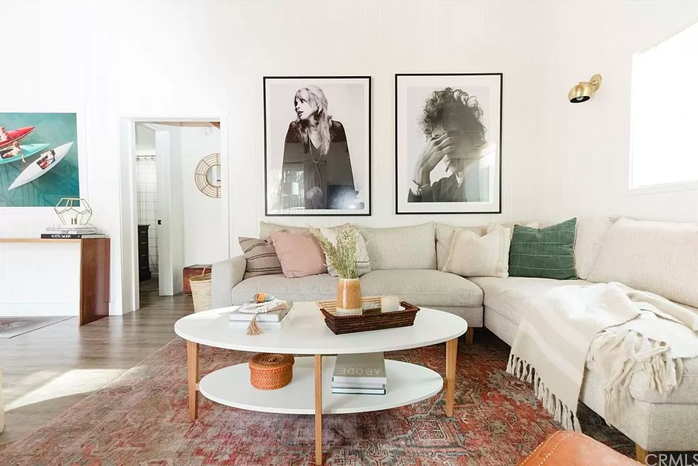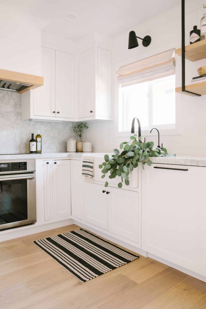
As far as design trends go, it sort of feels like white kitchens are a thing of the past and warmer, woodsier, darker and more natural or contemporary kitchens are making a comeback HOWEVER, I sort of view white kitchens as a clean slate and depending on the materials used, offer a timeless look that (hopefully) won’t look dated in ten years.
As my mom and I were talking about kitchen design, we both realized that it had been at least a decade since either of us had enjoyed an all white kitchen that we were both leaning toward it and agreed on all design ideas pretty quickly.
With the low ceilings and beams and smaller combined space of the living room and kitchen, this house felt very dark a a bit claustrophobic when we entered and we wanted to open it up and give it more of a consistent design that felt light rather than heavy. Painting everything white, including the ceilings and beams and brick fireplace really helped make it feel open and including the white kitchen gave it a more cohesive “lake house” look rather than an outdated dark cabin vibe.
The white brightened it all up and made it feel larger as well when thinking about the living room and kitchen being part of the same space.
Way Before…
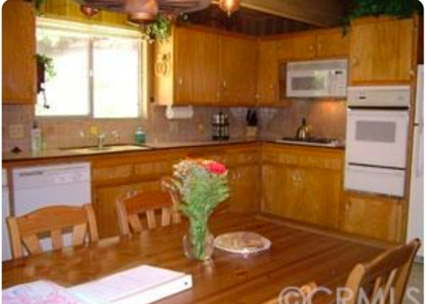
When Purchased…
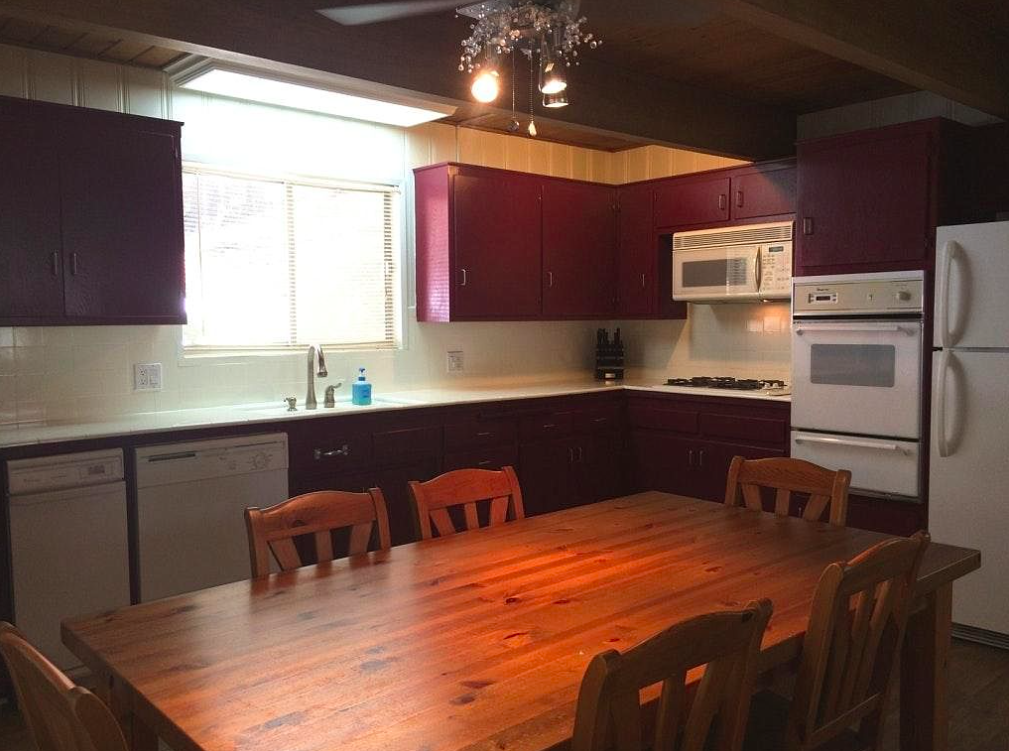
If you look at the before photos (above), the kitchen (and entire house) was wall to wall wood paneling and wood cabinets and well, wood everything. When my parents purchased it, it had been partially painted white, with burgundy cabinets and two-toned wood stained ceiling and beams and outdated white appliances.
They demoed the entire space, Chad rewired the area and updated plumbing and I got to work on the design. To create an open kitchen that offered as much storage and cabinets space as possible and create more seating options, I moved the refrigerator to the opposite wall to open up the far side and create a peninsula at the edge to break up the living room and kitchen while also keeping the flow and adding a bar for extra counter space and seating.
Since there’s no dining room area in this house, the only table sitting option is in the small breakfast nook in the kitchen by the window, so the peninsula bar adds 3-5 more seating options. We thought about an island but with the half wall on the left side, which we couldn’t remove because it’s supporting, an island would have looked clunky while the peninsula gives it a better visual flow, matching the look of the supporting wall. The last option was to keep it open entirely to allow for a table to sit in the center, but that just felt too cluttered as well, leaving the actual kitchen to feel unfinished.
Now… In Progress…
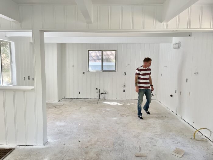
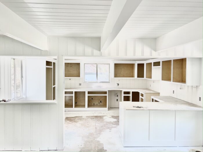
The photo above is where we are at now in the process. Obviously we’ve had some bumps in the road as far as timing and contractors, which is always to be expected during renovations, and of course we thought we’d have it 100% complete by now (or two months ago), but we’re close… as soon as we get the cabinet doors doors installed, sink, countertops, hardware, lighting and appliances, we’ll be good to go.
I’ll probably go over all of this again in the final post when it’s complete, but just to give you an idea behind the process of designing it and the inspiration behind it… below are some all white kitchen inspiration photos.
Inspiration…
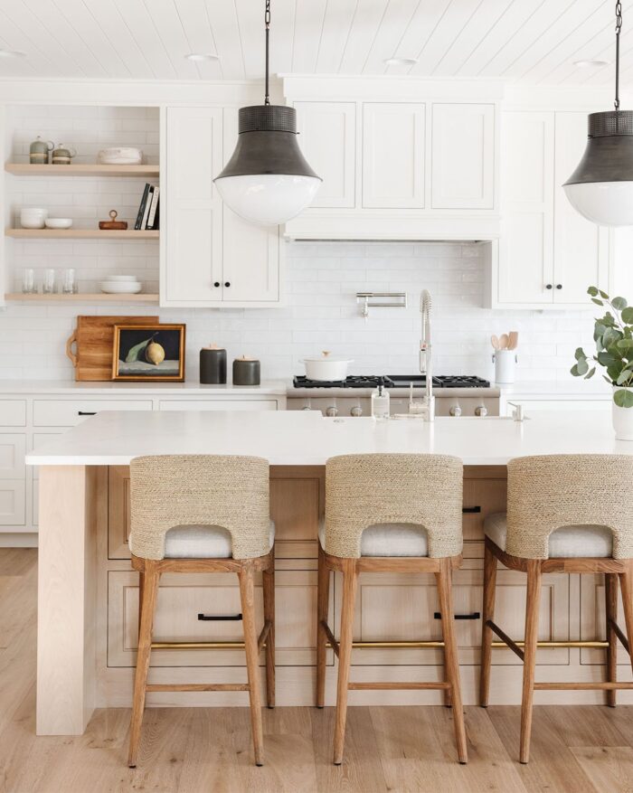
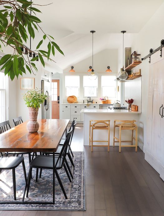
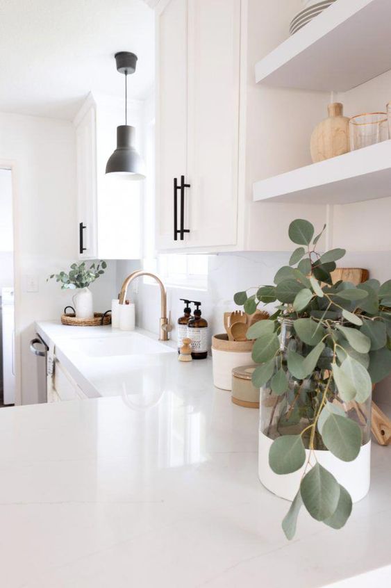
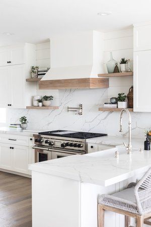
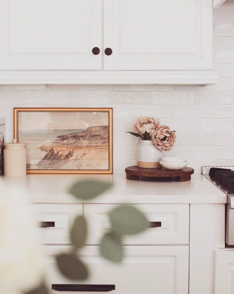
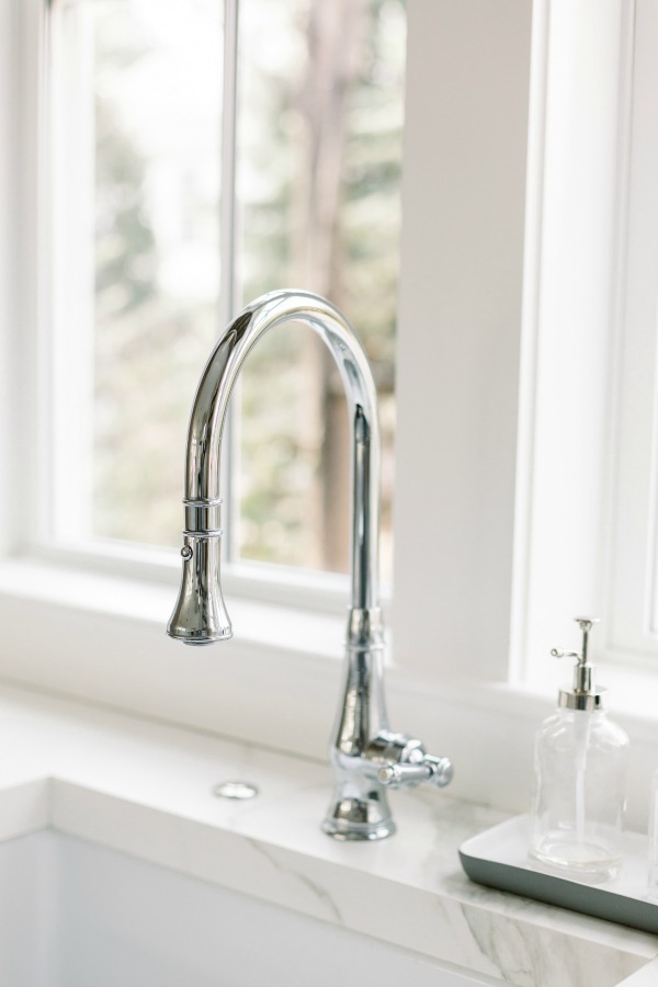
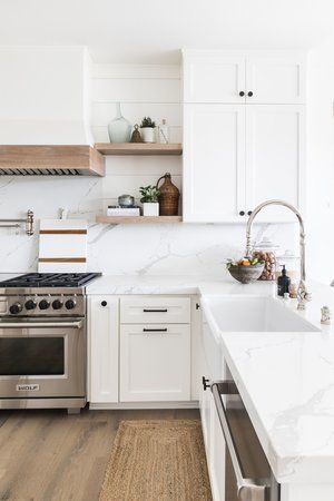
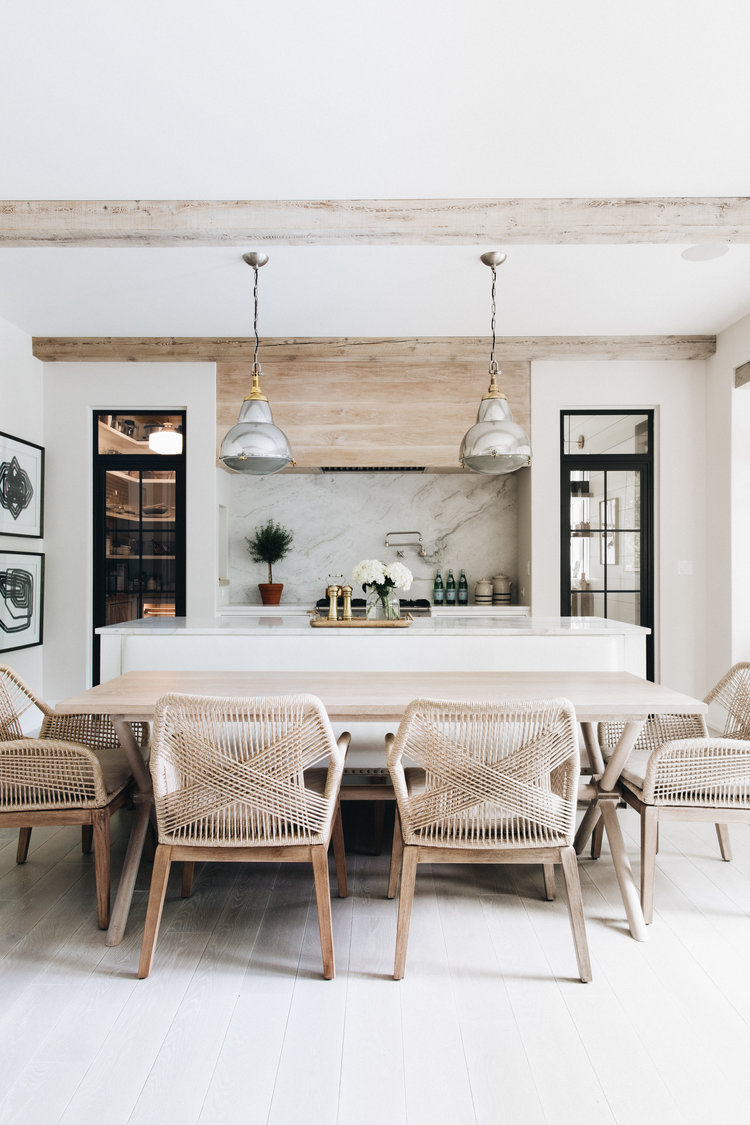
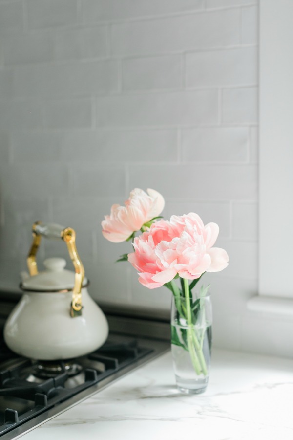
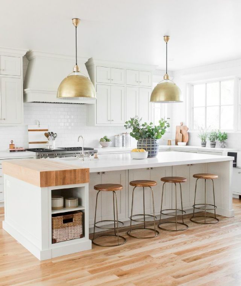
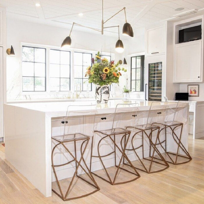

image sources: my Pinterest Kitchen Board // hello lovely studio // Style by Emily Henderson // kitchens // Studio McGee
Happy Thursday Lovecats!
* Find all my Home Decor and Design posts here
* Find all the Lake House Renovation posts here
Home // Family Lake House Renovation Update – Lake Arrowhead


